


This is my second article about extending the TailwindCSS color system. If you haven’t read the first one, I recommend you start here. The actual end goals aren’t that closely related, but I used similar strategies to get there. The first post explains these strategies with greater detail.
I use the word “button” throughout the article, but all of this applies to a broader scope, that of interactive surfaces. Those may or may not be HTML
<button>elements or have a traditional button role (think of an interactive card, menu item, or custom checkbox). Since the word “button” is both shorter and more relatable than the abstract concept of “interactive surface”, I’m sticking to that in order to get the point across.
Styling buttons with Tailwind is easy. But easy as it may be, I find it quite inconvenient.
A typical button will have many associated style rules, among them, a background color and a text color. Most of the time, the background color will change on hover, on focus (or better, focus-visible so it only shows when tabbing), on press, and when disabled. For some of these states, the text color (and/or other properties) may change too.
Base color, hover color, press color, focus color, and text color. That’s five colors per button. At the very least, that’s five utility classes on every button. It also requires you to have many colors in your palette and remember which ones are meant to be used together. At worst, it causes you to forget one of the states or cut it out of scope (looking at you, focus state) and your buttons just feel weird to use.
How to choose interaction state colors
What colors to use is not an engineering problem but a design one. And as it always is with those, there’s no single right answer. “Ask the designer” takes the problem off your hands, but that’s not always an option as there’s not always a designer to ask.
What can we do? Follow some established framework, of course. I particularly like the interaction states approach proposed by Material Design 3 (M3).
A quick intro to M3 Interaction States
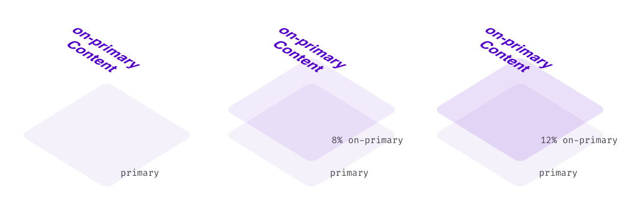
You can of course read the Material docs, but the TLDR is that they define most colors in the palette as pairs of “colors” and “on-colors”. The on-color is the default color of content on an element with a certain background.
Then, interaction states follow a simple rule. There’s the concept of a state layer between the background and the content of an element, and that state layer uses the on-color at different opacities for each of the interaction states.
For disabled buttons, they use the on-color for both content and background, at 38% and 12% opacities.
Implementation
I don’t expect you to be a CSS nerd like I am, but upon reading about the M3 interaction states for the first time, I thought “this state layers thing won’t work on the web!”. Let me explain:
- There’s no built-in state layer concept in CSS, only
background colorandcolor. - We can’t set the background color to a mix of the on-color and the color yet. CSS color-mix is only enabled in a couple of browsers under a developer flag, it’s nowhere near production-ready.
- We could do some hacky things with absolutely-positioned pseudoelements, but that’s clunky and could mess up the position of other things.
The DIY approach
We’ve found a bunch of roadblocks. However, something we can do is mix our colors manually with any tool we like (I used Alphredo) and add them to the Tailwind palette.
module.exports = {
  theme: {
    colors: {
      primary: {
        DEFAULT: '#f5f1fb',
        hover: '#e8def7',
        press: '#e1d4f5',
        focus: '#e1d4f5',
      }
      'on-primary': '#5401cd'
    }
  }
};
Okay, we have our colors, but to style our button we still need a nefarious string that in this case goes bg-primary hover:bg-primary-hover active:bg-primary-press focus-visible:bg-primary-focus text-on-primary disabled:text-on-primary/[0.38] disabled:bg-on-primary/[0.12]. Ugly.
Writing a Tailwind Plugin
Here’s where my last post comes in handy, as we can follow the same approach to abstract the current solution into a more elegant one. Here’s the link to the article again, just in case.
I built bottom-up last time, starting from a working version and trying to get to a reasonable interface. We’ll switch it up and go top-down this time. We know we want a wrapper for the Tailwind config that reads the theme, adds new colors to it, and then generates some Tailwind class to stand in for the massive string that we started with.
The source of truth
All we really need is the base colors and on-colors, as everything else is derived from those. Our color config will look pretty tidy. In our example, where we only have primary, it’s simply { primary: '#f5f1fb', 'on-primary': '#5401cd' }.
Generating the interaction colors
To mix on-color onto color, which I originally did with Alphredo, we can do programatically with the npm package color-composite. We can then add the new colors to the palette, same as with the mode-aware-colors plugin, only simpler, since they’re just plain hex values now.
Abstracting the interactive surface
The docs on Tailwind plugins describe the addComponents function as a way to ”add more opinionated, complex classes like buttons”. Exactly what we need.
For each of the colors we generated interaction colors for, we can call addComponents and add the styles. The documented syntax tells us to write CSS-in-JS, but this comment in a Tailwind issue speaks of an undocumented way to use Tailwind’s @apply. It’s not like we can’t live without this, but it saves some lookups in the theme object and allows for simpler code.
Here’s a (simplified) code snippet of the end result. We’re inside a forEach loop where for every colorName that has an on-color, we want to apply the required classes.
addComponents({
  [`.interactive-bg-${colorName}`]: {
    [`@apply bg-${colorName}`]: {},
    [`@apply text-on-${colorName}`]: {},
    [`@apply hover:bg-${colorName}-hover`]: {},
    [`@apply active:bg-${colorName}-press`]: {},
    [`@apply focus-visible:bg-${colorName}-focus`]: {},
    [`@apply disabled:text-on-${colorName}/[0.38]`]: {},
    [`@apply disabled:bg-on-${colorName}/[0.12]`]: {},
  }
})
In the end, from our original primary and on-primary colors we get the interactive-bg-primary class which applies our original long string of classes. Now we can consistently style all of our different buttons with one class each!
Bonus: extending the bg- utility
Material specifies that the default text color of an element is its on-color. Since we already have all this in place, wouldn’t it be nice to have the default text color be on-color when using bg-?
It turns out that we can define a component that has the same name as an existing utility, so within the same forEach loop that I mentioned before we can add this:
addComponents({
  [`.bg-${colorName}`]: {
    [`@apply text-on-${colorName}]: {}
  }
})
Now, when you use bg-, both the original utility and this new component will get applied to the element. Since utilities override components, if you also set a different text color, it will work as expected.
Closing thoughts
As with the previous plugin, this one is available on npm, and you can find the GitHub repo here. If you intend to use it, read the documentation as there are a few details I left out for the sake of the article.
It’s fully composable with tailwind-mode-aware-colors (you call it on the result of this one), so you can use both if that’s what you need.
And if you’re looking for something a little more automated, these two plugins inspired me to build a third one. Since the code behind the Material Theme Builder is public as a package, using it along my other two plugins I built tailwind-material-colors. It lets you to build Tailwind themes with dark mode and interaction states, all from a single color (or more if you prefer). There’s a live demo here where you can both read how to use it and play with dynamic theme changes.
I hope you learned something, added a couple of new plugins to your Tailwind toolbelt, or at least found some of this interesting. As for me, I’m planning on using tailwind-material-colors for small projects since it’s a way to get a color theme that’s different from the default Tailwind one with no design effort.
That might be just because I wrote it myself though. Would you use it? I’d love to hear from you.